


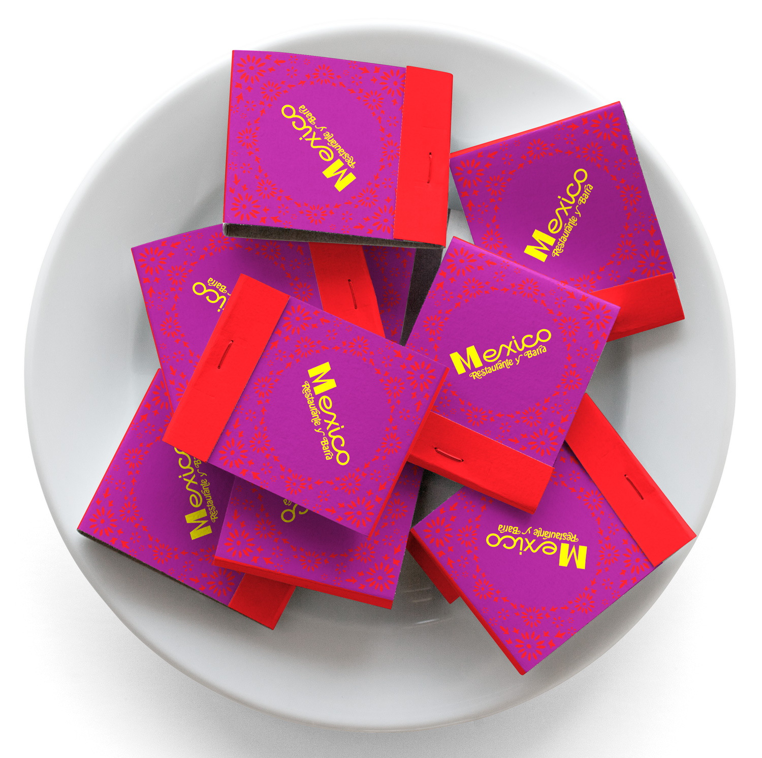


Mexico Restaurante y Barre
In the middle of the great recession, one of my favorite clients and good friend, Larry Nicola, asked AdamsMorioka to work on a new restaurant, Mexico Restaurante y Barre. I had worked with Larry on Nic’s, Beverly Hills, and now Larry wanted to open a restaurant that would feature traditional Mexican food with the best ingredients, and Larry’s amazing culinary flair. In our first meeting, he said he’d like it to feel like a great evening in Puerto Vallarta or Tijuana, minus the part where you wake up the next morning on the street with no recollection of what you’ve done.
Budget was a primary issue. So rather than fighting that and trying to do everything with the highest quality with minimal resources, I suggested we use the philosophy, “Quality is job 2.” The project would be a low-fi as possible. If we could do something by hand, we did, if we could manufacture something cheaper, we did. A huge amount of research was devoted to the vernacular of Mexican restaurants.
I was deeply impressed by the amount of enthusiasm inherent in many of the menus. So, I created a fictional person who would design everything. This person would be the relative of the owner with no design training, but a huge amount of enthusiasm and passion; someone who would give every piece her all with the very best intentions, but just get it wrong. We even convinced the off-the-shelf menu company to make the very low cost menu holders in turquoise, which they repeatedly reminded us might be garish.
The icons and frame elements were had-painted with a bad brush in someone’s left hand. The menus are color copied onto fluorescent paper. The stationery system was printed at a down and dirty printer. If I could cut a corner and make it cheaper, I did. Even the sticker system was printed at LA Label on cheap rolls.
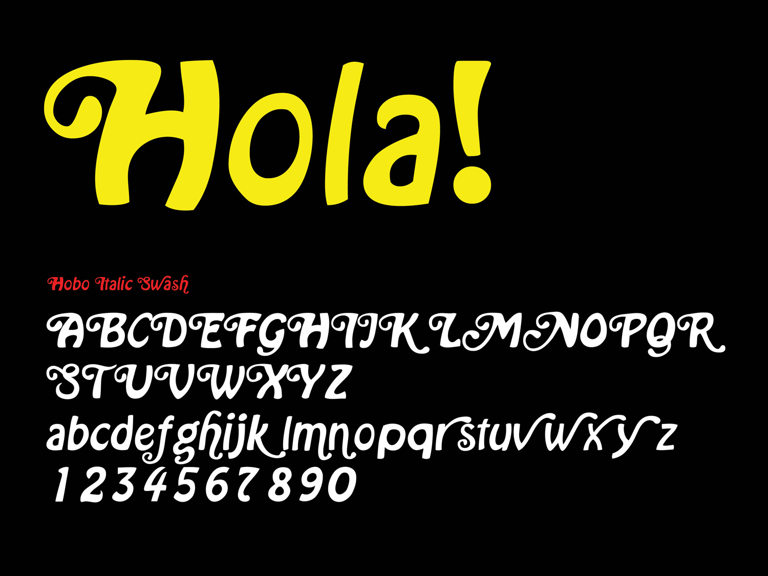
The system included a new font, Hobo Italic Swash, as Hobo was not ugly enough. And we designed Taco, based on a sign I saw in Mexico City. The color palette is meant to clash and vibrate, as if someone who had no color skill was let loose. Finally, the postcards used my bad snapshots of Mexico and a common hand-painted border. This led to results like a postcard of a random apartment building.
I knew the job was a success when I noticed a group of guests looking at different colored day-glow menus, then trading so each would have his or her favorite color.